> ## Documentation Index
> Fetch the complete documentation index at: https://wb-21fd5541-docs-3121.mintlify.site/llms.txt
> Use this file to discover all available pages before exploring further.
# Scatter plots
> Create and customize scatter plots in W&B to compare runs and visualize relationships between experiment metrics.
Use scatter plots in W\&B to compare runs and visualize relationships between experiment metrics. Scatter plots help you spot trends, outliers, and trade-offs across many runs, which is useful when tuning hyperparameters or comparing model variants.
## Use case
Use scatter plots to compare multiple runs and visualize the performance of an experiment. With a scatter plot, you can:
* Plot lines for minimum, maximum, and average values.
* Customize metadata tooltips.
* Control point colors.
* Adjust axis ranges.
* Use a log scale for the axes.
* Configure how the **frontier line** and related points are labeled and emphasized. See [Frontier line display options](#frontier-line-display-options).
* Add **reference lines** to mark thresholds or target values on an axis. See [Reference line display options](#reference-line-display-options).
## Example
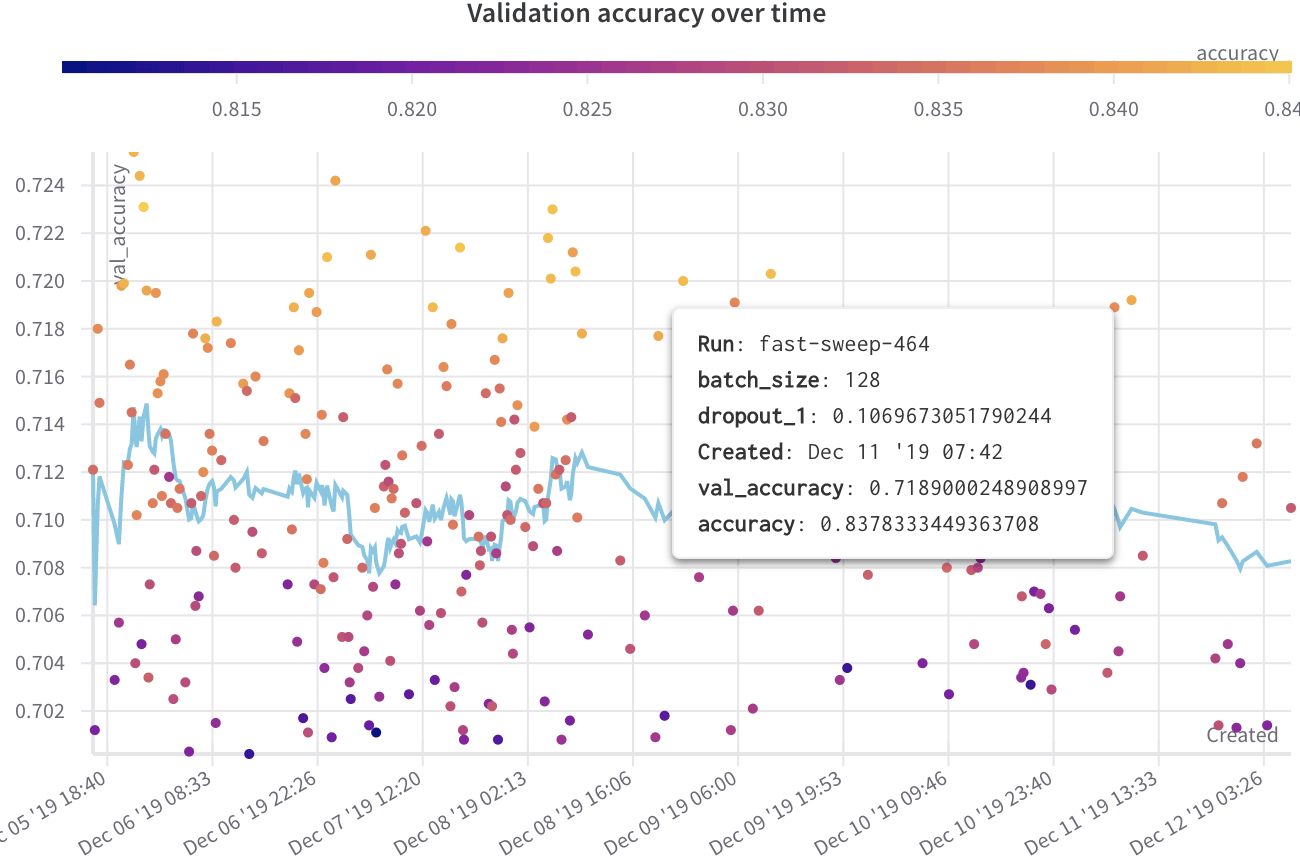
The following example shows a scatter plot displaying validation accuracy for different models over several weeks of experimentation. The tooltip includes batch size, dropout, and axis values. A line also shows the running average of validation accuracy.
[See a live example →](https://app.wandb.ai/l2k2/l2k/reports?view=carey%2FScatter%20Plot)
 ## Create a scatter plot
To create a scatter plot in the W\&B UI:
1. Navigate to the **Workspaces** tab.
2. In the **Charts** panel, click the **action ()** menu.
3. From the pop-up menu, select **Add panels**.
4. In the **Add panels** menu, select **Scatter plot**.
5. Set the `x` and `y` axes to plot the data you want to view. Optionally, set maximum and minimum ranges for your axes or add a `z` axis.
6. Click **Apply** to create the scatter plot.
The new scatter plot appears in the **Charts** panel, displaying the data you configured.
## Frontier line display options
The *frontier line* on a scatter plot connects the highest and lowest y-axis values observed so far for the data in the plot. You can tune how the line and the surrounding points appear from the plot settings to emphasize the frontier.
To configure frontier line display options:
1. Hover over the scatter plot panel, then click the gear icon to open the panel settings drawer.
2. Select the **Annotations** tab.
3. Set the options:
* **Show run labels**: Toggle whether to show a label with the run name or group name.
* **Dim non-frontier points**: Toggle whether to reduce the visual weight of points that aren't on the frontier line so the frontier stands out.
4. Click **Apply** to save your changes.
The scatter plot updates to reflect your annotation choices.
## Reference line display options
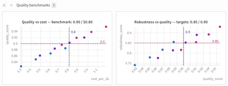
A *reference line* is a horizontal or vertical dashed line drawn at a fixed numeric value on the X or Y axis. Use reference lines to mark thresholds, benchmarks, or target values on a plot.
To configure reference lines:
1. Hover over the scatter plot panel, then click the gear icon to open the panel settings drawer.
2. Select the **Reference lines** tab.
3. Click **Add reference line**.
4. Configure the line:
* To choose a color, click the color swatch.
* Select **X axis** or **Y axis** from the dropdown.
* Enter a numeric value to draw the line at that point on the axis.
* Optional: Enter a label.
5. Repeat to add more lines. A counter next to **Add reference line** shows how many of the maximum you've used.
6. Click **Apply** to save your changes.
The scatter plot updates to reflect your reference line configuration.
To remove a reference line, click the close () button on its row.
## Create a scatter plot
To create a scatter plot in the W\&B UI:
1. Navigate to the **Workspaces** tab.
2. In the **Charts** panel, click the **action ()** menu.
3. From the pop-up menu, select **Add panels**.
4. In the **Add panels** menu, select **Scatter plot**.
5. Set the `x` and `y` axes to plot the data you want to view. Optionally, set maximum and minimum ranges for your axes or add a `z` axis.
6. Click **Apply** to create the scatter plot.
The new scatter plot appears in the **Charts** panel, displaying the data you configured.
## Frontier line display options
The *frontier line* on a scatter plot connects the highest and lowest y-axis values observed so far for the data in the plot. You can tune how the line and the surrounding points appear from the plot settings to emphasize the frontier.
To configure frontier line display options:
1. Hover over the scatter plot panel, then click the gear icon to open the panel settings drawer.
2. Select the **Annotations** tab.
3. Set the options:
* **Show run labels**: Toggle whether to show a label with the run name or group name.
* **Dim non-frontier points**: Toggle whether to reduce the visual weight of points that aren't on the frontier line so the frontier stands out.
4. Click **Apply** to save your changes.
The scatter plot updates to reflect your annotation choices.
## Reference line display options
A *reference line* is a horizontal or vertical dashed line drawn at a fixed numeric value on the X or Y axis. Use reference lines to mark thresholds, benchmarks, or target values on a plot.
To configure reference lines:
1. Hover over the scatter plot panel, then click the gear icon to open the panel settings drawer.
2. Select the **Reference lines** tab.
3. Click **Add reference line**.
4. Configure the line:
* To choose a color, click the color swatch.
* Select **X axis** or **Y axis** from the dropdown.
* Enter a numeric value to draw the line at that point on the axis.
* Optional: Enter a label.
5. Repeat to add more lines. A counter next to **Add reference line** shows how many of the maximum you've used.
6. Click **Apply** to save your changes.
The scatter plot updates to reflect your reference line configuration.
To remove a reference line, click the close () button on its row.
 Reference lines have the following behavior and limits:
* You can add a maximum of five reference lines per plot, counted across both axes combined, not five per axis.
* Only numeric axes support reference lines. Time-based axes don't. The axis dropdown only lists axes that qualify. If neither the X nor Y axis is numeric, the **Reference lines** tab displays `Reference lines require a numeric X or Y axis.` and you can't add a line.
* On an axis using a log scale, a reference line's value must be greater than zero.
* Each line renders as a dashed line in its assigned color. The default color is teal.
* The line's on-chart label shows the value followed by the label text, for example `0.9 - Quality target`. If you leave the label empty, the chart shows only the value. The chart truncates this combined label at 35 characters and preserves the full label in the panel configuration.
* When lines sit close together, W\&B automatically staggers their labels so they don't overlap.
Reference lines have the following behavior and limits:
* You can add a maximum of five reference lines per plot, counted across both axes combined, not five per axis.
* Only numeric axes support reference lines. Time-based axes don't. The axis dropdown only lists axes that qualify. If neither the X nor Y axis is numeric, the **Reference lines** tab displays `Reference lines require a numeric X or Y axis.` and you can't add a line.
* On an axis using a log scale, a reference line's value must be greater than zero.
* Each line renders as a dashed line in its assigned color. The default color is teal.
* The line's on-chart label shows the value followed by the label text, for example `0.9 - Quality target`. If you leave the label empty, the chart shows only the value. The chart truncates this combined label at 35 characters and preserves the full label in the panel configuration.
* When lines sit close together, W\&B automatically staggers their labels so they don't overlap.